
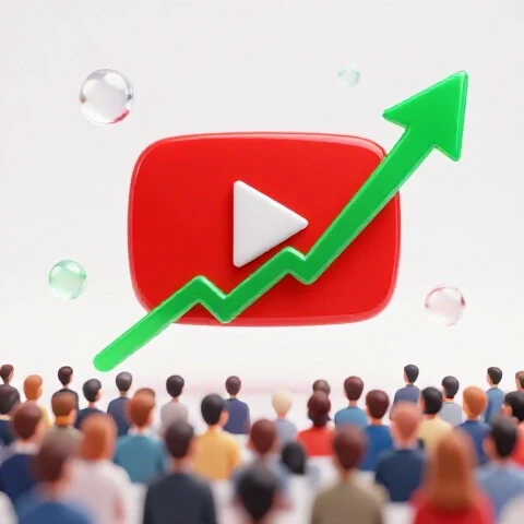
How to Get 50,000 Views on a YouTube Video (Step-by-Step Guide)
The moment your video finally gains traction is the exact moment you realize how little you actually control the platform. You spend months or years studying YouTube tips and obsessing over video creation strategies, yet when the numbers start to move, the experience is less about your actions and more about observing a system in motion. It is a paradox of effort where the hardest work happens before the upload, but the most intense learning happens while you are simply watching the screen.
Tracking the Journey to 50,000 Views
Tracking the journey to 50,000 views involves documenting the specific timeline and data shifts from the second a video is published until it crosses that milestone. This process focuses on the raw numbers found in the “Reach” and “Engagement” tabs of YouTube Analytics, providing a clear map of how a single piece of content moves through the system.
When I hit the publish button on the video that would eventually reach 50,000 views, the initial hours were remarkably quiet. For anyone following a YouTube growth guide, this period is often the most stressful because the data is thin. I sat at my desk, refreshing the real-time analytics every few minutes, watching the view count climb by ones and twos. It took nearly six hours just to break the first 500 views, a pace that felt entirely standard for my channel at the time.
Interestingly, the behavior of the “Realtime” chart began to change around the 12-hour mark. Instead of the typical “mountain” shape that peaks and then drops off, the line stayed flat and then began a slow, upward tilt. I recorded these intervals in a spreadsheet, noting that the velocity was increasing even as the initial notification burst to my existing subscribers began to fade. By the end of the first day, the video had reached 2,400 views, which was high for me but not yet a breakout.
| Timeline Interval | Cumulative View Count | Impression Count | Click-Through Rate (CTR) |
|---|---|---|---|
| 1 Hour | 85 | 1,200 | 6.2% |
| 12 Hours | 1,100 | 18,500 | 5.4% |
| 24 Hours | 2,400 | 42,000 | 5.1% |
| 48 Hours | 8,900 | 165,000 | 4.9% |
| 7 Days | 28,000 | 540,000 | 4.7% |
| 14 Days | 50,000 | 1,100,000 | 4.2% |
The First 24 Hours: Silence and Small Movements
The first 24 hours represent the “seed” phase where the video is primarily shown to your core audience and a small test group of new viewers. During this window, the data is most volatile as the sample size is small, and the initial engagement metrics like average view duration (AVD) are established.
During this first day, I noticed that my average view duration was holding steady at about 4 minutes on a 10-minute video. This 40% retention rate is a common benchmark I’ve seen in my channel growth diary entries. While the view count wasn’t exploding, the “Percentage Viewed” graph showed a very shallow drop-off in the first 30 seconds. This indicated that the people who clicked were staying long enough to get past the hook, which is a critical early indicator I always look for.
The 48-Hour Spike: When the Curve Changed
The 48-hour spike is the period where the real-time analytics window shows a distinct shift from linear growth to a steeper, more aggressive climb. This transition often marks the point where the video moves beyond the initial subscriber base and begins appearing in more “Suggested” or “Browse” locations across the platform.
Between hour 24 and hour 48, the video jumped from 2,400 views to nearly 9,000. I remember sitting in my home office, balancing my day job responsibilities, and checking the YouTube Studio app on my phone. The real-time bar for the “Last 60 Minutes” was no longer a series of small sticks; it was a solid wall of blue. This was the first time I saw the view count update by hundreds every time I pulled down to refresh the screen.
Key Analytics at the 10k, 25k, and 50k Intervals
Key analytics at these intervals provide a snapshot of how a video’s performance metrics evolve as the audience size scales from a niche group to a broader demographic. These metrics include Click-Through Rate (CTR), Average View Duration (AVD), and the ratio of likes to views, which often shift as the video reaches more people.
As the video crossed the 10,000-view mark, I noticed a slight dip in the Click-Through Rate. This is a common occurrence in video marketing for creators because as a video is shown to a wider, less targeted audience, a smaller percentage of those people will naturally click. At 1,000 views, my CTR was 6.1%, but by 10,000 views, it had leveled out at 5.2%. Watching this decline in real-time was a lesson in how scale affects efficiency; the video was reaching more people, but it was working harder to earn each click.
By the time the video reached 25,000 views, the “Traffic Sources” report was dominated by Browse Features. In my experience documenting sustainable YouTube growth, this is the stage where the video is no longer relying on search terms or direct links. It was being placed on the homepages of users who had never heard of my channel. Interestingly, the Average View Duration remained remarkably stable, only dropping from 4:00 to 3:52, which suggested the content was resonating even with a colder audience.
- 10,000 Views: CTR 5.2%, AVD 4:00, Top Source: Browse (65%)
- 25,000 Views: CTR 4.8%, AVD 3:55, Top Source: Browse (78%)
- 50,000 Views: CTR 4.2%, AVD 3:52, Top Source: Browse (82%)
Click-Through Rate (CTR) and Retention Stability
CTR and retention stability refer to the ability of a video to maintain its performance levels as it is pushed to larger and more diverse groups of viewers. Stability in these areas is often what allows a video to continue its upward trajectory toward a major milestone like 50,000 views without plateauing prematurely.
What struck me most during the climb to 50k was how the retention curve looked. In many of my previous videos, I would see a massive “cliff” at the one-minute mark. For this specific video, the curve was a smooth, gentle slope. At the 50,000-view mark, 35% of viewers were still watching at the 8-minute point. This consistency is what kept the video in the “Suggested” feeds. It wasn’t just about getting the click; it was about the video’s ability to hold that attention across a massive sample size.
The Impact on Channel Notifications and Community Engagement
The impact on channel notifications and community engagement describes the physical and digital “noise” that occurs when a video gains significant traction. This includes the frequency of new comment alerts, the “bell” notifications for new subscribers, and the overall shift in the tone and volume of viewer interactions.
The most immediate change I felt was the vibration of my phone. Usually, I receive a handful of comments per day, but as the video moved toward 50,000 views, the notification shade became unusable. I had to turn off “Push Notifications” for the YouTube Studio app because the sheer volume of “New Comment” and “New Subscriber” alerts was draining my battery and distracting me from my family life. It was a visceral reminder that the digital numbers represent real people interacting with my work in real-time.
The comment section itself transformed. In the early stages (0-5,000 views), the comments were mostly from “regulars”—people whose usernames I recognized. As the view count climbed toward 50,000, the comments became more diverse. I saw more questions, more debates between viewers in the reply threads, and, for the first time, a small amount of critical feedback. This shift in community engagement is a hallmark of a video moving into a broader ecosystem.
| Engagement Metric | At 5,000 Views | At 50,000 Views |
|---|---|---|
| Total Comments | 42 | 385 |
| Comment Velocity | ~2 per hour | ~15 per hour |
| New Subscribers | +115 | +1,850 |
| Like-to-Dislike Ratio | 99.1% | 97.4% |
Sentiment and Comment Velocity
Sentiment and comment velocity measure the emotional tone of viewer feedback and the speed at which that feedback arrives. Monitoring these during a high-growth event allows a creator to see how their message is being received by a wider audience and how quickly the conversation is evolving.
The “Comment Velocity” was particularly fascinating. At the peak of the 50,000-view climb, I was receiving a new comment every four to five minutes. I noticed that the sentiment remained largely positive, but the nature of the comments changed from “Great video, Michael!” to specific, deep-dive questions about the topic. This suggested that the video was being viewed as a resource rather than just entertainment. I spent my evening sessions responding to as many as I could, but eventually, the volume made it impossible to keep up with every single one.
Tools Used to Monitor the 50K Milestone
Tools used to monitor the 50k milestone are the specific software applications and dashboard features that allow a creator to track real-time data, analyze traffic sources, and manage engagement. These tools provide the objective data needed to understand the mechanics of a video’s growth while it is happening.
To keep track of this specific journey, I relied on a few key resources. While the native YouTube Studio app is the primary source, I used secondary trackers to help visualize the data over the two-week period it took to reach the goal.
- YouTube Studio Realtime Dashboard: This was my primary tool for watching the 48-hour and 60-minute view counts. It provided the most immediate feedback on whether the video’s momentum was increasing or slowing down.
- Google Sheets (Manual Tracking): Every morning at 8:00 AM, I logged the total views, impressions, and CTR. This helped me see the long-term trends that the real-time dashboard sometimes obscures.
- TubeBuddy / VidIQ Browser Extensions: I used these to monitor how the video was ranking for specific search terms during its climb. It was interesting to see the video move from page three to the top spot for its primary keyword as the view count increased.
- Notion Creator Hub: I kept a log of my observations here, noting the “vibe” of the comment section and any external factors, like a mention on social media, that might have contributed to the spikes.
Lessons from the 50,000 View Event
The lessons from the 50,000-view event are the practical takeaways gathered from observing the data and engagement patterns during a video’s growth. These insights focus on the behavior of the platform and the audience, providing a grounded perspective on what a creator can expect when a video performs well.
The biggest takeaway for me was the realization that “viral” is a relative term. To some, 50,000 views is a slow day; for me, it was a massive milestone that required a significant amount of “behind the scenes” monitoring. I learned that the most important metric wasn’t the total view count, but the stability of the Average View Duration. As long as that number stayed high, the platform continued to find new impressions for the video.
I also observed that the growth was not a straight line. There were “plateaus” where the view count would level off for six or twelve hours before another spike occurred. Understanding this rhythm helped me manage the emotional toll of checking the analytics. Instead of panicking when the numbers slowed down, I began to see it as the system “re-calculating” the next audience segment to show the video to.
- Retention is King: The video stayed alive because the retention curve remained flat.
- CTR Decays at Scale: Expect your click-through rate to drop as your video reaches more people.
- Engagement Compounds: More views lead to more comments, which lead to more views, creating a feedback loop.
- Notification Fatigue is Real: High-performing videos can be overwhelming if you don’t manage your notification settings.
Navigating the Emotional Toll of a High-Performing Video
Navigating the emotional toll involves managing the stress, excitement, and eventual burnout that can come from a video’s sudden success. For creators balancing full-time jobs and families, the pressure to respond to every comment and check every metric can quickly become overwhelming, making it essential to set boundaries.
During the two weeks it took to hit 50,000 views, I found myself constantly distracted. My “YouTube growth guide” mindset told me to stay engaged, but my reality as a professional and a family man meant I couldn’t be on my phone 24/7. I felt a strange mix of “imposter syndrome” and exhilaration. Was this a fluke? Could I do it again? These questions are common for creators in the 1k–20k subscriber range.
To combat this, I established a “strategy session” window. I would only check the deep analytics once in the morning and once in the evening. This allowed me to stay informed without letting the numbers dictate my mood for the entire day. I realized that the video was going to do what it was going to do, whether I watched the real-time bar move or not. This shift in perspective was vital for my long-term sustainability as a creator.
Conclusion: The Reality of the 50K Milestone
Reaching 50,000 views on a single video is a significant event that provides a wealth of data for any analytical creator. It is a moment where the theories of “the algorithm” become a tangible reality seen in your own dashboard. For me, this journey was a masterclass in observation. It showed me that while I can control the quality of the content and the initial packaging, the platform’s response is a complex interaction of viewer behavior and data thresholds.
If you are currently sitting between 1,000 and 20,000 subscribers, watching a video take off can feel like a dream, but the actual experience is much more about data management and emotional regulation. The key is to document everything. Use your spreadsheets, take screenshots of your retention curves, and pay attention to how the comment section changes. These are the “hard-earned lessons” that will inform your next upload and help you build a predictable system for growth.
Your next step is to look at your own “top-performing” video, regardless of its current view count. Open the “Reach” tab and look at the impressions over time. Do you see the same “plateaus and spikes” I described? Understanding your own patterns is the first step toward achieving your next milestone, whether that is 10k, 30k, or your own first 50,000-view event.
Frequently Asked Questions
How long did it take for the video to reach 50,000 views?
In this specific case, it took exactly 14 days from the moment of upload to cross the 50,000-view mark. The growth was not linear; the first 2,400 views happened in the first 24 hours, followed by a significant acceleration between days two and seven. The final stretch from 30,000 to 50,000 views was a steady climb as the video became a “Suggested” staple for its niche.
Did the Click-Through Rate (CTR) stay the same throughout the growth?
No, the CTR actually decreased as the view count increased. It started at a strong 6.2% during the first hour when it was shown to my most loyal subscribers. By the time it reached 50,000 views and was being shown to a much broader audience via Browse Features, the CTR had settled at 4.2%. This is a normal part of the scaling process on YouTube.
How many subscribers did the video gain during this period?
Did the traffic source change as the video grew?
Yes, significantly. In the first 12 hours, the primary traffic sources were “Subscribers” and “External” (from my own email list and social sharing). By the 48-hour mark, “Browse Features” took over as the dominant source. At the 50,000-view milestone, over 80% of the total views were coming from Browse, meaning the video was being recommended on users’ home screens.
How did you handle the sudden influx of comments?
It was overwhelming at first. I had to disable push notifications on my phone to maintain my focus on my full-time job and family. I eventually set aside 30 minutes every evening specifically for “community management,” where I would heart and reply to the most insightful or urgent questions. This helped keep the engagement high without leading to burnout.
Was there a specific “tipping point” for the views?
The tipping point occurred around the 36-hour mark. This is when the “Realtime” chart stopped showing a downward trend after the initial upload burst and instead began to trend upward. This “second wave” of views is often the indicator that a video has moved from the “subscriber phase” to the “discovery phase.”
Did you use any external marketing to get to 50k?
Beyond the initial share to my existing email list and a single post on LinkedIn, the growth was entirely organic within the YouTube ecosystem. The vast majority of the 50,000 views came from the platform’s own recommendation systems (Browse and Suggested) rather than external promotion.
What happened to the “Like-to-Dislike” ratio at scale?
The ratio remained very high but did dip slightly. It started at 99.1% with my core audience and ended at 97.4% at the 50,000-view mark. As a video reaches a broader audience, you inevitably reach people who may not perfectly align with your style or perspective, which often results in a few more dislikes or critical comments.
Did you make any changes to the video after it was published?
I did not change the video file itself, but I did monitor the CTR closely. Because the CTR was holding steady above 4%, I decided not to change the thumbnail or title during the climb. My philosophy is “if it isn’t broken, don’t fix it,” especially when a video is currently experiencing a growth spike.
(This article was written by one of our staff writers, Michael Hale. Visit our Meet the Team page to learn more about the author and their expertise.)