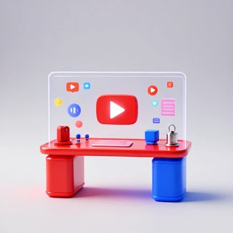
Create a Thumbnail for YouTube Video (1-Minute Mockup!)
Let me tell you a story.
I once knew a small gaming channel, “Pixelated Adventures,” that was struggling to break 100 views per video.
They had great gameplay, engaging commentary, but their channel was lost in the YouTube abyss.
Then, they decided to revamp their thumbnails.
They went from bland screenshots to vibrant, eye-catching designs.
The result?
Their views skyrocketed, their subscriber count exploded, and within a month, they were seeing thousands of views per video.
This transformation wasn’t magic; it was the power of a well-designed thumbnail.
And if you’re a content creator, you need to understand this power too.

Section 1: The Importance of Thumbnails on YouTube
So, what exactly is a thumbnail?
Simply put, it’s the face of your video on YouTube.
It’s the first thing people see when scrolling through search results or suggested videos.
Think of it as your video’s first impression, and we all know how important those are!
Thumbnails are crucial because they directly impact your click-through rate (CTR).
A high CTR means more people are clicking on your video, which signals to YouTube that your content is engaging and worth promoting.
This, in turn, leads to more visibility and, ultimately, more viewers.
According to a study by YouTube Creator Academy, 90% of the best-performing videos on YouTube have custom thumbnails.
That’s a staggering statistic!
It highlights the undeniable correlation between a well-crafted thumbnail and video success.
Beyond CTR, thumbnails play a vital role in branding.
Consistent use of colors, fonts, and design elements across your thumbnails helps viewers recognize your content instantly.
It’s like seeing the Golden Arches and immediately knowing it’s McDonald’s.
Your thumbnails should be just as recognizable.
Section 2: Understanding the 2025 Landscape
Now, let’s fast forward to 2025.
What will thumbnails look like then?
The YouTube landscape is constantly evolving, and thumbnail design is no exception.
Currently, we’re seeing a trend towards bold, minimalist designs with clear text and striking visuals.
This is driven by the increasing use of mobile devices for video consumption.
Thumbnails need to be easily readable on smaller screens.
By 2025, I expect to see even greater integration of AI in thumbnail creation.
AI tools will be able to analyze video content and automatically generate optimized thumbnails based on viewer data and predicted performance.
Imagine an AI that knows exactly what kind of thumbnail will resonate with your target audience!
Augmented reality (AR) might also play a role.
Imagine thumbnails that subtly animate or change when viewed through a smartphone screen.
This could create a more engaging and interactive experience for viewers.
Another key factor is the changing preferences of YouTube audiences.
Viewers are becoming more discerning and are drawn to thumbnails that are authentic, relatable, and visually appealing. Generic or clickbaity thumbnails are losing their effectiveness.
Section 3: Key Elements of an Effective Thumbnail
So, what are the key ingredients of a thumbnail that will stand out in 2025?
Let’s break it down:
Bold and Readable Text: Your text should be large enough to be easily read on any device.
Use contrasting colors to make it pop against the background.
Avoid using overly complex fonts that are difficult to decipher.Striking Imagery: Use high-quality images that are relevant to your video’s content.
Consider using close-ups of faces expressing emotion or dynamic action shots.
Avoid blurry or pixelated images.Color Psychology: Colors have a powerful effect on our emotions.
Use color strategically to attract viewers and convey the right message.
For example, red can create a sense of urgency, while blue can evoke trust and calmness.Consistency with Brand Identity: Maintain a consistent visual style across all your thumbnails.
This helps viewers recognize your channel and builds brand recognition.
Let’s look at some examples.
Think about MrBeast’s thumbnails.
They are consistently bright, engaging, and often feature him with an exaggerated expression.
This consistency is key to his branding.
Or consider channels like Kurzgesagt – In a Nutshell.
Their thumbnails use a distinct minimalist style and color palette, making them instantly recognizable.
Section 4: The 1-Minute Thumbnail Mockup Process
Time is precious, especially for busy content creators.
So, how can you create a compelling thumbnail in just one minute?
Here’s a step-by-step guide:
Brainstorming Ideas: Before you even open your design software, take a moment to brainstorm.
What’s the core message of your video?
What’s the most visually interesting element?
Try to capture the essence of your video in a single image and a few words.Selecting the Right Tools: There are tons of great tools available for thumbnail creation.
Some popular options include:- Canva: A user-friendly platform with a wide range of templates and design elements.
I personally use Canva for most of my thumbnails. - Adobe Spark: Another excellent option with a focus on creating visually stunning graphics.
- PicMonkey: A versatile tool with advanced editing features.
- Canva: A user-friendly platform with a wide range of templates and design elements.
Designing On-the-Fly: Here are some tips for creating a quick thumbnail mockup:
- Start with a Template: Don’t reinvent the wheel!
Use a pre-designed template as a starting point and customize it to fit your needs. - Use Pre-Made Elements: Platforms like Canva offer a vast library of icons, illustrations, and stock photos.
Take advantage of these resources to save time. - Focus on the Key Elements: Prioritize the text and the main image.
These are the elements that will have the biggest impact on viewers.
- Start with a Template: Don’t reinvent the wheel!
-
Finalizing the Thumbnail: Once you have your mockup, take a few seconds to polish it.
- Check the Resolution: Make sure your thumbnail is at least 1280×720 pixels (the recommended size for YouTube).
- Ensure Readability: Double-check that the text is easy to read on different devices.
- Follow YouTube’s Guidelines: Avoid using overly suggestive or misleading content.
Section 5: Advanced Techniques for 2025 Thumbnails
To truly stand out in 2025, you’ll need to go beyond the basics and embrace some more advanced techniques.
Incorporating Interactive Elements: Consider adding elements like QR codes to your thumbnails.
These codes could link to related content or exclusive offers.Using Dynamic Visuals or GIFs: For platforms that support them, experiment with using short animated GIFs as thumbnails.
This can create a more eye-catching and engaging experience.Adapting to Mobile-First Design Principles: With the increasing number of mobile viewers, it’s crucial to design thumbnails that look great on smaller screens.
Use large, clear text and avoid clutter.-
AI-Powered Personalization: As AI technology advances, we may see the emergence of personalized thumbnails that are tailored to individual viewers based on their viewing history and preferences.
Section 6: Case Studies of Successful Thumbnails
Let’s analyze some successful thumbnails from different niches:
- Gaming: Channels like PewDiePie often use thumbnails with exaggerated facial expressions and bold text that highlights the most exciting moments from their gameplay.
- Beauty: Beauty gurus like James Charles typically use close-up shots of their makeup looks with vibrant colors and a focus on detail.
- Education: Educational channels like Khan Academy often use simple, clean thumbnails with clear text and illustrations that summarize the key concepts being taught.
- Vlogs: Vloggers like Emma Chamberlain often use casual, relatable thumbnails that capture the essence of their daily life.
I’ve spoken to several content creators about their thumbnail strategies.
One common theme is the importance of experimentation.
Don’t be afraid to try different styles and see what works best for your audience.
Another key takeaway is the need for consistency.
Maintain a consistent visual style across all your thumbnails to build brand recognition.
Section 7: A/B Testing Your Thumbnails
A/B testing is a powerful technique for optimizing your thumbnails.
It involves creating two different versions of a thumbnail and testing them against each other to see which one performs better.
Here’s a simple guide to A/B testing your thumbnails:
- Create Two Versions: Design two different thumbnails for the same video.
Focus on changing one key element, such as the text, the image, or the color scheme. - Use a Testing Tool: There are several tools available for A/B testing thumbnails, such as TubeBuddy and Thumbnail Test.
- Analyze the Results: After running the test for a few days, analyze the results to see which thumbnail had a higher click-through rate.
- Implement the Winner: Use the winning thumbnail for your video to maximize your views.
I’ve personally seen significant improvements in my CTR by using A/B testing.
It’s a simple but effective way to ensure that your thumbnails are as engaging as possible.
Section 8: Common Mistakes to Avoid
Finally, let’s discuss some common mistakes to avoid when designing thumbnails:
- Using Low-Quality Images: Blurry or pixelated images will turn viewers off.
Always use high-resolution images that are sharp and clear. - Using Too Much Text: Overcrowding your thumbnail with text can make it difficult to read.
Keep it concise and focus on the most important information. - Being Misleading or Clickbaity: Don’t use thumbnails that are deceptive or unrelated to your video’s content.
This will frustrate viewers and damage your reputation. - Ignoring YouTube’s Guidelines: Make sure your thumbnails comply with YouTube’s community guidelines.
Avoid using overly suggestive or violent content.
In conclusion, creating compelling thumbnails is essential for success on YouTube.
By understanding the key elements of effective design, embracing advanced techniques, and avoiding common mistakes, you can create thumbnails that will captivate viewers and drive more traffic to your channel in 2025 and beyond.
So, go out there, experiment, and start creating thumbnails that will make your videos shine!